
Email design - responsive and guaranteed to get results
How do we measure web design success? What reporting is available for websites?
If you own a shop, you're aware of trends - maybe Friday evening is always busy in a fish & chip shop, as is Saturday lunchtime. You know how much you took on any given day, and how many fish you got through, but beyond that, the details of your success elude you. How many people looked at the menu on the pavement then walked away? How many people came in your shop but didn't buy? And for what reason? Which were your busiest tables? Who tried to find a seat but couldn't and went to the chippy up the road? How long did it take people to finish their fish supper and leave?
With the web and the web-tools we have available now you can find out all of that! Who came to your site, where they live, what time they visited, how long they spent on your site, which links they clicked on, how many pages they looked at, whether or not they bought anything, if they watched your video or downloaded your guide, if they read your opening spiel on your homepage and decided that your site wasn't for them.
The same applies for your campaigns. You can get any number of metrics to determine whether or not your promotion was a success, which parts of it were well received and which bits you can improve in order to make your campaign a resounding success next time.
Content Management Systems - what are they, and what is the difference between that and a flat HTML site?
If you are looking for a simple brochure style website, with few or no updates anticipated and little functionality, then your requirements are very different from a business who is looking to constantly update their eCommerce site from which they are going to conduct most of their business.
The two main categories of website are HTML/Flat brochure style, and content managed. The primary differentiator is that the owner/web editor/web manager can't update the former without prior website design/development experience and training. They are intended to be updated byt a professional web designer or developer who has to delve into code to make updates. This has a time and cost implication every time an update needs to be made. A flat HTML website will however be the cheaper option as they require less time and effort to set up. On the downside, they have limited capability for functionality.
A website with a content management system (CMS) on the other havnd however, costs more to build, but that cost will be offset by the fact that they are designed with the intention that the webmaster/owner/content manager will be making the updates, and in that case they are able to do it as and when they like, as often as they like, without a cost involved. CMS websites are typically suited to larger websites, that will be updated more frequently that their HTML counterparts.
A CMS site is built using a content management system framework (Wordpress for example), and is connected, via a programming language to a data source, such as an SQL database, where the large majority of the content is stored. CMS websites make use of language more complicated that HTML such as php or ASP.NET to allow for greater functionality and interaction.
What are the advantages of making use of a website to promote and market my business online?
One advantage of promoting and marketing your business by means of a website is that you can promptly and easily make updates to your online promotional material. Unlike print marketing and advertising you can come up with a new marketing initiative in a meeting at 9am, by lunchtime it can be live and you will know whether or not it's likely to be a success by the time you go home at half five, changing or updating your offering the next morning should you wish. You can also react to market forces or opportunities in the market, being among the first movers when an opportunity presents itself. Print advertising simply wouldn't allow you to do this, the lead times being significantly greater.
It also reduces the amount of time and money you spend on outdated campaigns. Once your offer changes or is no longer available, with a print campaign all of your posters and flyers that you've painstakingly had produced at great expense need to go in the bin, with great cost to you and a significant cost to the environment. With a website, you simply get in touch with your webmaser/web designer/website manager and they will quickly and cleanly make the change for you online, and you are ready to go with absolutely no waste. And should you have chosen to have a content managed website (CMS) it's even easier - you simply log in to your site and make the changes yourself.
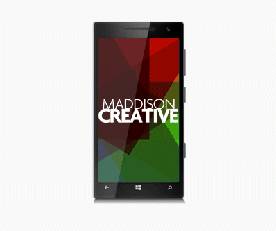
With the increasing popularity of mobile devices, what are responsive websites and how is web design affected?
Two out of every three minutes spent online in the UK are users browsing on either a smartphone or a tablet. 13% of adults in the UK browse the internet exclusively using their smartphone, 2% more than browse exclusively on their desktop computer.
In the last two years tablet internet use grew by almost a third, and in the same two year period smartphone use grew by 78%, while desktop internet use has decreased.
The way people use smartphones to access the internet has revolutionized the way websites are built. Long gone are the days that companies were happy to have customers browse their full, desktop version of their site on their smartphone, causing users to zoom in and out of areas of the page that interested them, struggling to click on the tiny text links to navigate. If you're building a website for the modern internet user, the likelihood is that if they don't view your site exclusively on their mobile device, they'll at least check you out via their iPhone or Android phone before sitting down later at their computer to have a more in-depth look.
This is why most clients want a 'mobile-first' approach to their website, whereby you ensure that everything looks and behaves beautifully on a mobile device before considering a desktop version, and if something has to compromise, it certainly won't be the mobile site.
A 'responsive' website is one that adapts to the device it's being viewed on, whether that is a desktop computer, a mobile phone or a tablet. The content is then displayed in a way that is optimized for said device, improving user experience.
How have mobile devices influenced web design, and what are responsive websites?
Two in every three minutes spent online are spent by users using a handheld mobile device (phone/tablet), while thirteen percent of adults in the United Kingdom browse the web only on their mobile phone, whereas 11 percent browse the web only on their desktop which highlights the trend in the diminishing reliance on desktop computers in favour of mobile devices. Over the last two years, tablet use to browse the internet has increased by around 33%, whereas in the same time frame mobile use in browsing the web has increased by almost 80%, whereas desktop use in browsing the web has diminished.
This has influenced the way that web designers are now required to build websites. Because of the high likelihood that someone who arrives at your site will be using a mobile device, it is now the norm to design for 'mobile first', which means that everything functions and renders beautifully on a mobile device first and foremost, and then secondarily we will consider how it looks and feels on a desktop. It seems like a long time ago that companies were happy for users to browse the full version of their website on their smartphone, having to scrollabround the page and zoom into areas they were interested in looking at in closer detail, struggling to navigate using tiny text hyperlinks.
One practice, when smartphones were becoming popular, was to create a totally separate version of your site for mobiles, but as technology has developed it is now possible to use css to adapt your website to the device it is being viewed upon, so the user is effectively seeing exactly the same page irrespective of their device, it is just rendered differently because it is pulling in different styles. A website built in this way is known as 'responsive'.
More answers to web design questions...
Where to next?
Web Design | Online Advertising | Interactive Design | Email Design | Graphic Design | Video & Animation | Brand & Creative | Training | Design Consultancy