
Web design and how it can help you
What can a website say about your brand?
You only have one opportunity to make a first impression, and for most businesses, your website is the first point of contact that many customers have with your brand, so it's vitally important that your website reflects well on your business.
With the average time an internet user spends on any one webpage being around just eleven seconds, you don't have long to convince them that you are not only reputable (and internet users are particularly cynical in this day and age - and who can blame them with so many unscrupulous people lurking in the more dimly lit corners of the web!), but you are trustworthy, conscientious, that they won't receive any nasty surprises, that your service or product will be of good quality and if there's a problem you will deal with it courteously. If they have even the slightest inkling that you may not tick all of those boxes, then they will quickly jump ship and try your next competitor, and you'll never hear from them again!
On the other hand, should you get your website/branding combo right, then you can give your brand any character and tone of voice you wish, irrespective of the location and size of your business.
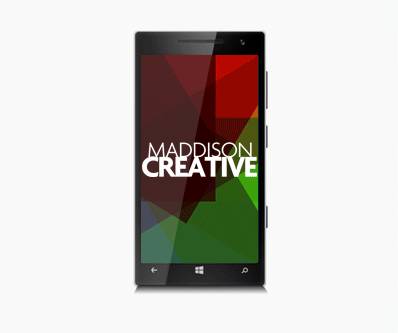
Maddison Creative web design Newcastle are specialists in the use of shapes, photography, colour and typography in order to encourage internet users to feel the way your want them to feel about your business and website, whether it's an entertainment brand that you want people to associate with energy, passion and excitement, or a health spa where you want people to feel at ease, relaxed and empowered. Emotion plays a large part in online user behaviour/experience and so it's vitally important you capitalize on that in order to get the most from your website.
What technologies do you use to design websites?
For functionality, we use php, an open-source, commonly used scripting language that is particularly well suited to web development and that can be inserted into HTML. For Content Managed Websites we use Wordpress, an open source, online website creation tool built in php. We use HTML5, CSS3 and Javascript to develop front-end website interaction, functionality and animation. We use SQL and MYSQL wherever we need a database, and from a design perspective we use the Adobe Creative suite to create for the web.
With the increasing popularity of mobile devices, what are responsive websites and how is web design affected?
Two out of every three minutes spent online in the UK are users browsing on either a smartphone or a tablet. 13% of adults in the UK browse the internet exclusively using their smartphone, 2% more than browse exclusively on their desktop computer.
In the last two years tablet internet use grew by almost a third, and in the same two year period smartphone use grew by 78%, while desktop internet use has decreased.
The way people use smartphones to access the internet has revolutionized the way websites are built. Long gone are the days that companies were happy to have customers browse their full, desktop version of their site on their smartphone, causing users to zoom in and out of areas of the page that interested them, struggling to click on the tiny text links to navigate. If you're building a website for the modern internet user, the likelihood is that if they don't view your site exclusively on their mobile device, they'll at least check you out via their iPhone or Android phone before sitting down later at their computer to have a more in-depth look.
This is why most clients want a 'mobile-first' approach to their website, whereby you ensure that everything looks and behaves beautifully on a mobile device before considering a desktop version, and if something has to compromise, it certainly won't be the mobile site.
A 'responsive' website is one that adapts to the device it's being viewed on, whether that is a desktop computer, a mobile phone or a tablet. The content is then displayed in a way that is optimized for said device, improving user experience.
More answers to web design questions...
Where to next?
Web Design | Online Advertising | Interactive Design | Email Design | Graphic Design | Video & Animation | Brand & Creative | Training | Design Consultancy