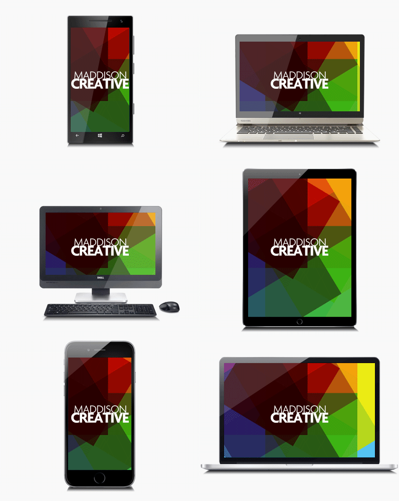
Increase the reach of your business by maximising the potential
How do we measure web design success? What reporting is available for websites?
If you own a shop, you're aware of trends - maybe Friday evening is always busy in a fish & chip shop, as is Saturday lunchtime. You know how much you took on any given day, and how many fish you got through, but beyond that, the details of your success elude you. How many people looked at the menu on the pavement then walked away? How many people came in your shop but didn't buy? And for what reason? Which were your busiest tables? Who tried to find a seat but couldn't and went to the chippy up the road? How long did it take people to finish their fish supper and leave?
With the web and the web-tools we have available now you can find out all of that! Who came to your site, where they live, what time they visited, how long they spent on your site, which links they clicked on, how many pages they looked at, whether or not they bought anything, if they watched your video or downloaded your guide, if they read your opening spiel on your homepage and decided that your site wasn't for them.
The same applies for your campaigns. You can get any number of metrics to determine whether or not your promotion was a success, which parts of it were well received and which bits you can improve in order to make your campaign a resounding success next time.
Graphic Design for the web
Often, graphic design is used as another term for 'print design' ie. design for printed communications; leaflets, posters, brochures, logo design, magazine layouts and advertising. However, in 2017 there is so much crossover between website design (digital design or even 'graphic design for the web') and graphic design, it's very difficult to tell where one ends and another begins. Often the same designer will be responsible for online and offline creative, blurring the lines even more. Generally though, a designer will specialise in one discipline (either web or print) but will need to be able to be comfortable with the other in order to succeed in design.
What technologies do you use to design websites?
For functionality, we use php, an open-source, commonly used scripting language that is particularly well suited to web development and that can be inserted into HTML. For Content Managed Websites we use Wordpress, an open source, online website creation tool built in php. We use HTML5, CSS3 and Javascript to develop front-end website interaction, functionality and animation. We use SQL and MYSQL wherever we need a database, and from a design perspective we use the Adobe Creative suite to create for the web.
With the increasing popularity of mobile devices, what are responsive websites and how is web design affected?
Two out of every three minutes spent online in the UK are users browsing on either a smartphone or a tablet. 13% of adults in the UK browse the internet exclusively using their smartphone, 2% more than browse exclusively on their desktop computer.
In the last two years tablet internet use grew by almost a third, and in the same two year period smartphone use grew by 78%, while desktop internet use has decreased.
The way people use smartphones to access the internet has revolutionized the way websites are built. Long gone are the days that companies were happy to have customers browse their full, desktop version of their site on their smartphone, causing users to zoom in and out of areas of the page that interested them, struggling to click on the tiny text links to navigate. If you're building a website for the modern internet user, the likelihood is that if they don't view your site exclusively on their mobile device, they'll at least check you out via their iPhone or Android phone before sitting down later at their computer to have a more in-depth look.
This is why most clients want a 'mobile-first' approach to their website, whereby you ensure that everything looks and behaves beautifully on a mobile device before considering a desktop version, and if something has to compromise, it certainly won't be the mobile site.
A 'responsive' website is one that adapts to the device it's being viewed on, whether that is a desktop computer, a mobile phone or a tablet. The content is then displayed in a way that is optimized for said device, improving user experience.
What's the market like for eCommerce and good web design?
The eCommerce sector in the UK is huge and steadily growing. UK online sales increased by an estimated 15% last year. 77% of people who went online made a purchase, with an average order value of around £78.
Around a third of e-commerce traffic in the UK is on a handheld device. In terms of mobile traffic distribution, a third is on tablets while the remaining two thirds is on a smartphone, which is a result of the increase in size of the screens on mobile phones.
Investments in digital advertising are also on the rise. Last year they represented almost exactly half of the total advertising spend in the UK, and this is expected to climb another 10% by 2020. Given the growth of e-commerce in the UK, it is normal that more and more advertisers are choosing to dedicate a more significant part of their advertising spend to online channels.
More answers to web design questions...
Where to next?
Web Design | Online Advertising | Interactive Design | Email Design | Graphic Design | Video & Animation | Brand & Creative | Training | Design Consultancy

