
Joined up campaigns acros a variety of media including print and
How do we measure web design success? What reporting is available for websites?
If you own a shop, you're aware of trends - maybe Friday evening is always busy in a fish & chip shop, as is Saturday lunchtime. You know how much you took on any given day, and how many fish you got through, but beyond that, the details of your success elude you. How many people looked at the menu on the pavement then walked away? How many people came in your shop but didn't buy? And for what reason? Which were your busiest tables? Who tried to find a seat but couldn't and went to the chippy up the road? How long did it take people to finish their fish supper and leave?
With the web and the web-tools we have available now you can find out all of that! Who came to your site, where they live, what time they visited, how long they spent on your site, which links they clicked on, how many pages they looked at, whether or not they bought anything, if they watched your video or downloaded your guide, if they read your opening spiel on your homepage and decided that your site wasn't for them.
The same applies for your campaigns. You can get any number of metrics to determine whether or not your promotion was a success, which parts of it were well received and which bits you can improve in order to make your campaign a resounding success next time.
What can a website say about your brand?
You only have one opportunity to make a first impression, and for most businesses, your website is the first point of contact that many customers have with your brand, so it's vitally important that your website reflects well on your business.
With the average time an internet user spends on any one webpage being around just eleven seconds, you don't have long to convince them that you are not only reputable (and internet users are particularly cynical in this day and age - and who can blame them with so many unscrupulous people lurking in the more dimly lit corners of the web!), but you are trustworthy, conscientious, that they won't receive any nasty surprises, that your service or product will be of good quality and if there's a problem you will deal with it courteously. If they have even the slightest inkling that you may not tick all of those boxes, then they will quickly jump ship and try your next competitor, and you'll never hear from them again!
On the other hand, should you get your website/branding combo right, then you can give your brand any character and tone of voice you wish, irrespective of the location and size of your business.
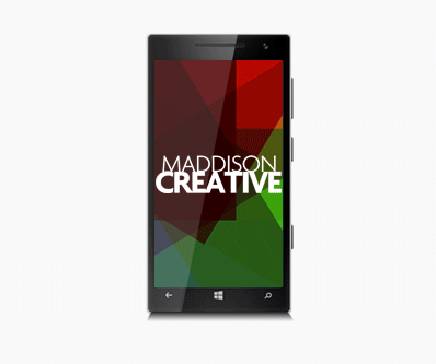
Maddison Creative web design Newcastle are specialists in the use of shapes, photography, colour and typography in order to encourage internet users to feel the way your want them to feel about your business and website, whether it's an entertainment brand that you want people to associate with energy, passion and excitement, or a health spa where you want people to feel at ease, relaxed and empowered. Emotion plays a large part in online user behaviour/experience and so it's vitally important you capitalize on that in order to get the most from your website.
What is Wordpress?
Wordpress is an open-source Content Management System built using php. It is probably the simplest to use, most widely-used and powerful CMS/blogging system there is available today, perfectly suited to developing websites.
There are many many websites on the web that make use of Wordpress; big corporates sites, news sites, music sites and famous people use it to manage their website (or have their 'people' manage their website). TechCrunch, The New York Times and CNN all use Wordpress.
Because of its open source nature, there are literally thousands of 'themes' (pre-built designs/layouts for websites) - some paid for and some free, and 'plug-ins' (which give your website added functionality once installed, or 'plugged-in'), again, some free and some paid for.
How do I proactively promote my website online?
There are an ever increasing number of ways to promote your business online, some free and some have a cost, but when running a business it's important to explore every avenue. Methods of promoting your business for free include:
- Website SEO Optimize your website so that it will readily be picked up by search Engines such as Google and Bing. This is by far the most effective way of promoting your business online, it is free and it has the largest reach...if done well!
- Social Media Marketing Use your social channels and communities to push your business to your peers. You can include share and like buttons from most of the social media providers which removes any obstacles between a happy customer on your site and them recommending you to their peers. Many social media sites allow you to pull content from their sites and display said content on your site. This is a great way of keeping your customers abreast of updates in real-time, whilst also keeping your site content fresh.
- Reciprocal links Get as many sites as you can to link to your site, this will not only drive traffic but it will also be recognized as a positive by search engines, boosting your ranking.
Paid for options include:
- PPC (pay-per-click) advertising Create an ad that will appear at the top of a search engine results page or on an affiliates' website that you only pay for (a pre-agreed price) when a user is interested by your offering and clicks on your ad. No clicks, no cost.
- Facebook ads & Twitter cards This is highly targetable, which means you can define exactly who you want to see your ads based on their interests, their location and a range of other criteria.
- Email campaigns Email marketing technology is used by 82% of B2B and B2C companies. Can also be free, depending on your distribution method. Directly communicate with your client base or distribution list with a beautifully designed email. A wide range of reporting tools available, allowing you to see how your email (and different parts of your email) has performed. Can contain dynamic content, can be fully automated and can feature triggered elements.
With the increasing popularity of mobile devices, what are responsive websites and how is web design affected?
Two out of every three minutes spent online in the UK are users browsing on either a smartphone or a tablet. 13% of adults in the UK browse the internet exclusively using their smartphone, 2% more than browse exclusively on their desktop computer.
In the last two years tablet internet use grew by almost a third, and in the same two year period smartphone use grew by 78%, while desktop internet use has decreased.
The way people use smartphones to access the internet has revolutionized the way websites are built. Long gone are the days that companies were happy to have customers browse their full, desktop version of their site on their smartphone, causing users to zoom in and out of areas of the page that interested them, struggling to click on the tiny text links to navigate. If you're building a website for the modern internet user, the likelihood is that if they don't view your site exclusively on their mobile device, they'll at least check you out via their iPhone or Android phone before sitting down later at their computer to have a more in-depth look.
This is why most clients want a 'mobile-first' approach to their website, whereby you ensure that everything looks and behaves beautifully on a mobile device before considering a desktop version, and if something has to compromise, it certainly won't be the mobile site.
A 'responsive' website is one that adapts to the device it's being viewed on, whether that is a desktop computer, a mobile phone or a tablet. The content is then displayed in a way that is optimized for said device, improving user experience.
How have mobile devices influenced web design, and what are responsive websites?
Two in every three minutes spent online are spent by users using a handheld mobile device (phone/tablet), while thirteen percent of adults in the United Kingdom browse the web only on their mobile phone, whereas 11 percent browse the web only on their desktop which highlights the trend in the diminishing reliance on desktop computers in favour of mobile devices. Over the last two years, tablet use to browse the internet has increased by around 33%, whereas in the same time frame mobile use in browsing the web has increased by almost 80%, whereas desktop use in browsing the web has diminished.
This has influenced the way that web designers are now required to build websites. Because of the high likelihood that someone who arrives at your site will be using a mobile device, it is now the norm to design for 'mobile first', which means that everything functions and renders beautifully on a mobile device first and foremost, and then secondarily we will consider how it looks and feels on a desktop. It seems like a long time ago that companies were happy for users to browse the full version of their website on their smartphone, having to scrollabround the page and zoom into areas they were interested in looking at in closer detail, struggling to navigate using tiny text hyperlinks.
One practice, when smartphones were becoming popular, was to create a totally separate version of your site for mobiles, but as technology has developed it is now possible to use css to adapt your website to the device it is being viewed upon, so the user is effectively seeing exactly the same page irrespective of their device, it is just rendered differently because it is pulling in different styles. A website built in this way is known as 'responsive'.
More answers to web design questions...
Where to next?
Web Design | Online Advertising | Interactive Design | Email Design | Graphic Design | Video & Animation | Brand & Creative | Training | Design Consultancy